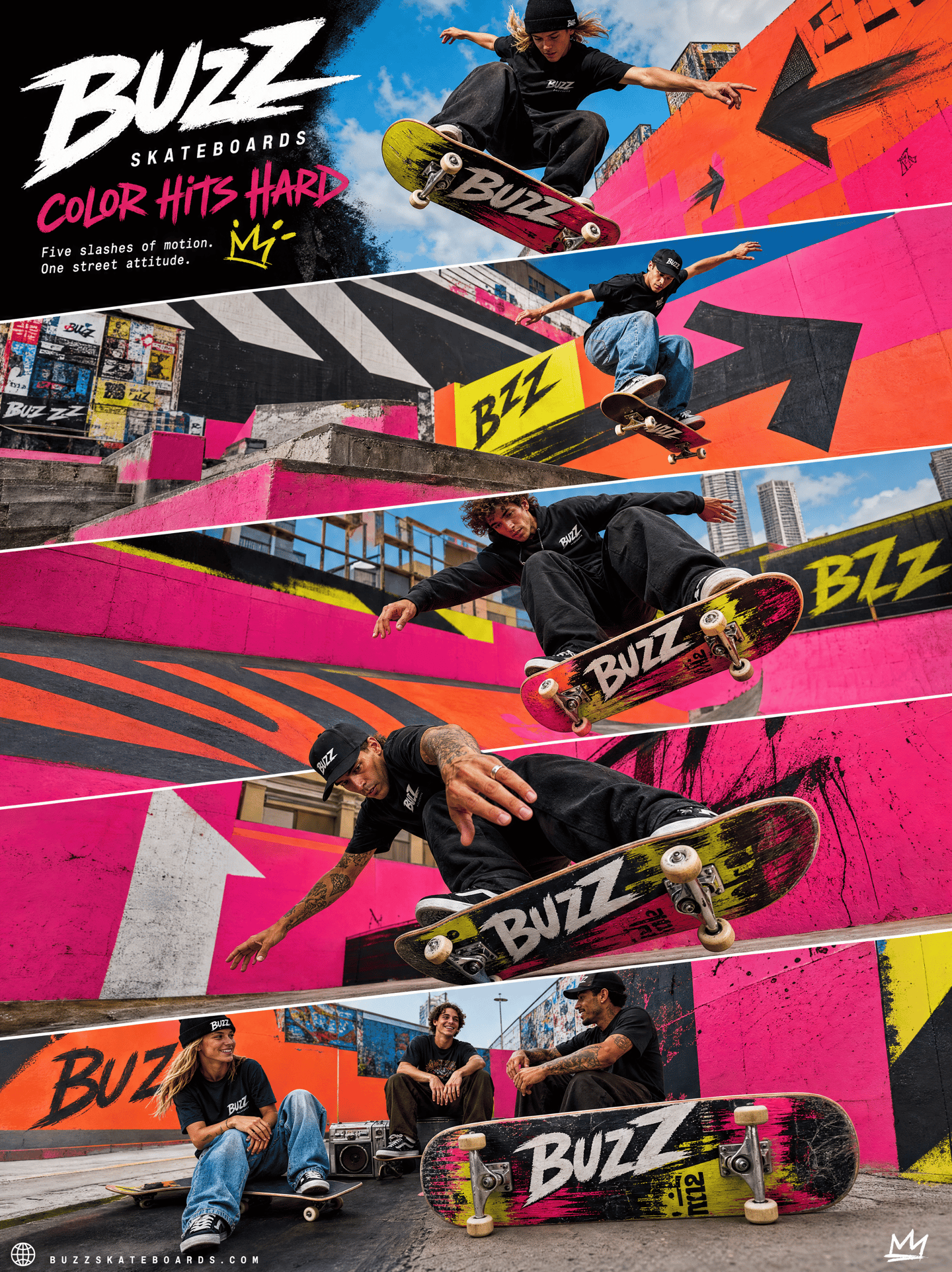
Create an ultra-premium five-panel diagonal campaign board for Buzz Skateboards. Use a tall vertical poster made of five large slanted strips stacked from top to bottom, all tilted in the same direction to create speed and forward motion. The campaign must feel hyper-real, rebellious, saturated, sharp, premium, and brand-led, with the skateboard and riders as the visual focus.
Core concept: Present Buzz Skateboards as a youth-culture universe where skating, color, attitude, design, and city surfaces collide. Build a stylized urban playground with neon color-block walls, spray-painted concrete, oversized symbols, arrows, bold geometry, poster fragments, and controlled street-art energy. The setting must feel curated and premium, not chaotic.
Panel structure: Panel 1: explosive opening hero action. Panel 2: a fast technical trick in a graphic urban zone. Panel 3: stronger motion and speed in a painted environment. Panel 4: aggressive close perspective with pressure and street intensity. Panel 5: a lifestyle-plus-product ending with the skateboard still dominant.
Action: Show different young Western skaters performing authentic professional street-skate action with real skill, sharp body language, and strong style. Include an ollie or flip trick, carving or sliding, stair or ledge movement, a low-angle landing, and one final attitude-driven board moment. The action must feel technical, forceful, and believable, never posed. Keep every skateboard clearly visible.
Skateboard realism: Use true street skateboards with real wheels, accurate trucks, authentic deck curvature, convincing grip tape, visible underside graphics where appropriate, scrape wear, chipped edges, and premium product realism. Buzz Skateboards identity should feel central through deck graphics, board culture, and credible street attitude.
Environment: Use huge neon walls, spray-painted asphalt, oversized graffiti marks, graphic arrows, acid-bright fields, hot pink or electric orange concrete, neon-blue shadows, paint drips, hand-drawn accents, and layered poster edges. Every background element must strengthen the rider and board rather than distract from them.
Perspective: Use aggressive wide-angle or slight fisheye sports-editorial photography with large foreground boards, deep urban lines, low-angle jumps, diagonal architecture, and riders moving toward the camera. Each panel may have a different visual attack, but all five must share one color system and brand language.
Typography: Main title: “BUZZ SKATEBOARDS” Campaign line: “COLOR HITS HARD” Supporting copy: “Five slashes of motion. One street attitude.” Use sparse, sharp, urban typography with subtle handwritten-graffiti influence, refined spacing, and a minimal official-style logo treatment.
Lighting: Use bright outdoor urban light with crisp commercial clarity. Skin, clothing, wheels, trucks, decks, walls, and painted ground must look sharp and expensive. Keep highlights energetic and shadows open, detailed, and clean.
Color palette: electric orange, hot pink, acid yellow, neon coral, vivid cyan, deep cobalt, lime accents, spray white, matte black grip tape, and sunlit urban gray. The palette should feel loud, youthful, graphic, and premium, never cheap or toy-like.
Mood: rebellious, youthful, explosive, saturated, technical, urban, fearless, stylish, globally branded.
Rendering style: ultra-premium Buzz Skateboards campaign board, five-panel diagonal editorial layout, authentic street-skate action, neon color-block environments, bold graphics, graffiti-inspired typography, hyper-real sports photography, 8K commercial quality.
Negative prompt: cheap skate flyer, weak board visibility, fake skateboard hardware, awkward body motion, cluttered graffiti, muddy colors, childish street art, influencer posing, plastic skin, messy typography, generic youth poster, random clutter, low-resolution sports ad.