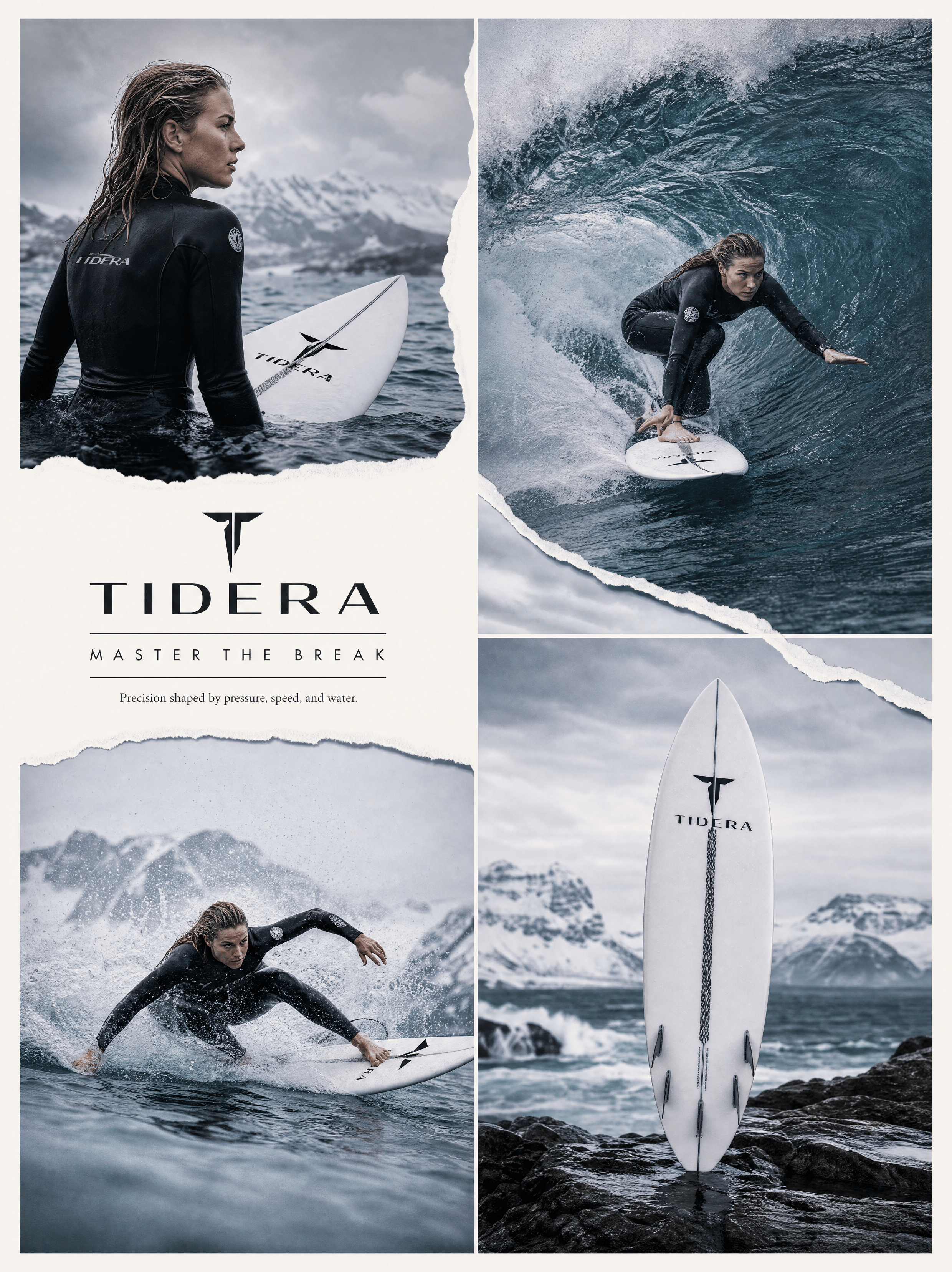
 Create an ultra-premium four-panel advertising campaign board for TIDERA, designed as a high-impact cold-water surf campaign. Use a clean 2x2 grid on a refined off-white poster background with elegant spacing, strong negative space, and crisp torn-paper collage elements. The final image must feel hyper-real, cold, technical, cinematic, and brand-led, with the surfboard as the visual hero.
Core concept: Present TIDERA through carving precision, line control, wave-reading instinct, and surf performance. The board must be a true high-performance surfboard, never a skateboard: no wheels, trucks, axles, or street-skate hardware. The ocean must feel like a serious competition zone rather than a tropical vacation scene.
Panel layout: Top-left: a poised cold-water lineup or ocean-entry moment. Top-right: the main hero shot, with a professional female surfer carving through or beneath a deep blue-gray wave wall. Bottom-left: a more aggressive low-angle action shot with tighter turning, stronger rail pressure, greater speed, and dense spray. Bottom-right: a product-led surfboard hero shot on wet rock, dark sand, or a cold shoreline.
All panels must share the same cold climate, color temperature, brand attitude, and editorial logic. Create a visual rhythm between calm focus, explosive carving, and product precision.
Action: Show a professional Western female surfer with authentic athletic control, believable body mechanics, strong posture, visible muscle engagement, and competition-level seriousness. No influencer or travel-model mood. Her movements must feel skilled, fast, and decisive. Use compressed stance, strong shoulder alignment, clear rail pressure, and realistic wave-reading. Keep the surfboard clearly visible and never hidden by spray.
Board realism: Use a believable high-performance surfboard with realistic rails, rocker, tail shape, deck wax, fin system where visible, wet reflections, and true ocean proportions. The board should feel premium, fast, technically respected, and clearly branded with refined TIDERA graphics.
Water: Render giant cold competition waves with deep blue-gray walls, steel-blue shadows, clean barrel curvature, precise lip tension, detailed spray, fine white foam breakup, and believable water mass. The waves should feel heavy, cold, clean, and powerful. Add subtle mist and airborne droplets without visual chaos.
Torn-paper design: Integrate elegant ripped-paper arcs, strips, or diagonal paths between panels, with subtle rough edges and clean editorial collage logic. The effect should feel modern, premium, and collectible, not messy or handmade.
Typography: Main title: “TIDERA” Campaign line: “MASTER THE BREAK” Supporting copy: “Precision shaped by pressure, speed, and water.” Keep all typography sparse, sharp, refined, and well integrated into the layout.
Lighting: Use cool coastal daylight with luxury-commercial precision. Water, skin, and board surfaces must feel crisp and expensive. Use clean highlights, open cool shadows, and strong clarity without muddy blacks or warm tropical tones.
Color palette: deep blue-gray, steel blue, slate teal, white spray, cool skin highlights, wet graphite, soft off-white, and restrained board accents. Keep the palette elegant, serious, and competition-driven.
Mood: cold, technical, athletic, premium, controlled, cinematic, surf-driven, collectible, globally branded.
Rendering style: ultra-premium TIDERA campaign board, four-panel editorial sports collage, professional female surfing action, true surfboard, cold-water realism, torn-paper graphics, premium English typography, hyper-real commercial photography, 8K quality.
Negative prompt: skateboard, wheels, trucks, axle hardware, tropical vacation mood, muddy waves, weak board visibility, low-detail spray, messy torn-paper effect, bulky typography, influencer pose, plastic skin, cartoon water, cluttered layout, warm beach colors, low-resolution sports ad.
Create an ultra-premium four-panel advertising campaign board for TIDERA, designed as a high-impact cold-water surf campaign. Use a clean 2x2 grid on a refined off-white poster background with elegant spacing, strong negative space, and crisp torn-paper collage elements. The final image must feel hyper-real, cold, technical, cinematic, and brand-led, with the surfboard as the visual hero.
Core concept: Present TIDERA through carving precision, line control, wave-reading instinct, and surf performance. The board must be a true high-performance surfboard, never a skateboard: no wheels, trucks, axles, or street-skate hardware. The ocean must feel like a serious competition zone rather than a tropical vacation scene.
Panel layout: Top-left: a poised cold-water lineup or ocean-entry moment. Top-right: the main hero shot, with a professional female surfer carving through or beneath a deep blue-gray wave wall. Bottom-left: a more aggressive low-angle action shot with tighter turning, stronger rail pressure, greater speed, and dense spray. Bottom-right: a product-led surfboard hero shot on wet rock, dark sand, or a cold shoreline.
All panels must share the same cold climate, color temperature, brand attitude, and editorial logic. Create a visual rhythm between calm focus, explosive carving, and product precision.
Action: Show a professional Western female surfer with authentic athletic control, believable body mechanics, strong posture, visible muscle engagement, and competition-level seriousness. No influencer or travel-model mood. Her movements must feel skilled, fast, and decisive. Use compressed stance, strong shoulder alignment, clear rail pressure, and realistic wave-reading. Keep the surfboard clearly visible and never hidden by spray.
Board realism: Use a believable high-performance surfboard with realistic rails, rocker, tail shape, deck wax, fin system where visible, wet reflections, and true ocean proportions. The board should feel premium, fast, technically respected, and clearly branded with refined TIDERA graphics.
Water: Render giant cold competition waves with deep blue-gray walls, steel-blue shadows, clean barrel curvature, precise lip tension, detailed spray, fine white foam breakup, and believable water mass. The waves should feel heavy, cold, clean, and powerful. Add subtle mist and airborne droplets without visual chaos.
Torn-paper design: Integrate elegant ripped-paper arcs, strips, or diagonal paths between panels, with subtle rough edges and clean editorial collage logic. The effect should feel modern, premium, and collectible, not messy or handmade.
Typography: Main title: “TIDERA” Campaign line: “MASTER THE BREAK” Supporting copy: “Precision shaped by pressure, speed, and water.” Keep all typography sparse, sharp, refined, and well integrated into the layout.
Lighting: Use cool coastal daylight with luxury-commercial precision. Water, skin, and board surfaces must feel crisp and expensive. Use clean highlights, open cool shadows, and strong clarity without muddy blacks or warm tropical tones.
Color palette: deep blue-gray, steel blue, slate teal, white spray, cool skin highlights, wet graphite, soft off-white, and restrained board accents. Keep the palette elegant, serious, and competition-driven.
Mood: cold, technical, athletic, premium, controlled, cinematic, surf-driven, collectible, globally branded.
Rendering style: ultra-premium TIDERA campaign board, four-panel editorial sports collage, professional female surfing action, true surfboard, cold-water realism, torn-paper graphics, premium English typography, hyper-real commercial photography, 8K quality.
Negative prompt: skateboard, wheels, trucks, axle hardware, tropical vacation mood, muddy waves, weak board visibility, low-detail spray, messy torn-paper effect, bulky typography, influencer pose, plastic skin, cartoon water, cluttered layout, warm beach colors, low-resolution sports ad.ultra-premium four-panel advertising