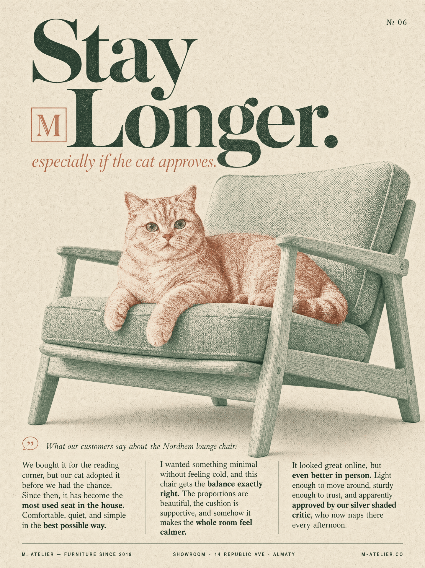
Vertical editorial poster in the style of a premium design magazine spread. Clean paper-textured background with a duotone photo-collage subject, refined serif typography, and multi-column editorial body text. Mood of a high-end furniture publication with Scandinavian lifestyle aesthetics.
Canvas: Vertical 2:3 poster. Background is soft warm light beige paper with subtle grain and faint halftone dot texture, tactile and magazine-like. A small page number "№ 06" in small uppercase serif sits in the top-right corner.
Main headline (top of poster, large elegant serif, deep forest-green): Stacked on two lines in a bold high-contrast serif:
"Stay
Longer."
The word "Longer" has a small square logo-badge nested inline before it — a minimalist "M" glyph in a muted accent color, scaled to match the x-height of the lowercase letters.
Italic serif sub-headline (right below, smaller, muted terracotta color):
"especially if the cat approves."
Slightly offset to the right, playful and refined.
Central visual (dominant, middle 60% of the poster): A duotone-treated photographic composition of a silver shaded cat lounging comfortably on an IKEA-inspired Scandinavian lounge chair. The cat is a silver shaded British Shorthair type, with plush fur, round face, soft greenish eyes, and a calm, mildly curious expression. The chair is a clean modern Scandinavian design with a pale wood frame, soft upholstered cushions, and a cozy minimalist silhouette. The chair is rendered in a muted sage-green duotone, while the cat is rendered in a warm dusty-rose / terracotta duotone. The two subjects overlap in a refined editorial composition, like a two-ink screen print. Subtle halftone dot texture appears across both elements. Soft shadows fall onto the paper background. The cat looks naturally relaxed, clearly enjoying the chair.
Three-column body text block (bottom third of the poster, small justified serif, deep charcoal-green):
Above the columns, a small italic serif intro line with a subtle icon:
"What our customers say about the Nordhem lounge chair:"
Then three narrow justified serif text columns, each 4–5 lines:
Column 1:
"We bought it for the reading corner, but our cat adopted it before we had the chance. Since then, it has become the most used seat in the house. Comfortable, quiet, and simple in the best possible way."
Column 2:
"I wanted something minimal without feeling cold, and this chair gets the balance exactly right. The proportions are beautiful, the cushion is supportive, and somehow it makes the whole room feel calmer."
Column 3:
"It looked great online, but even better in person. Light enough to move around, sturdy enough to trust, and apparently approved by our silver shaded critic, who now naps there every afternoon."
Add a few bolded phrases for emphasis across the paragraphs.
Bottom strip (very thin bar at the bottom, small uppercase tracked sans-serif):
Left-aligned:
"M. ATELIER — FURNITURE SINCE 2019"
Center:
"SHOWROOM · 14 REPUBLIC AVE · ALMATY"
Right:
"M-ATELIER.CO"
Palette: warm light beige paper background, muted sage-green duotone for the chair #7E9C8C, dusty terracotta-rose duotone for the cat and italic sub-headline #C97D67, deep forest-green typography #1F2A24, and soft charcoal accents. Typography: elegant high-contrast serif for headline and body, italic serif for accent lines, clean uppercase sans-serif for footer meta.
Mood: premium editorial, calm, cozy, playful but refined, like a Scandinavian furniture catalog or a curated interior design magazine.
Finish: tactile paper grain, subtle halftone texture, soft cast shadows, print-magazine feel. Awwwards / Behance / Cereal-magazine-quality editorial poster, 4k vertical.